Most status pages work but they’re lifeless
Most status pages work but
they’re lifeless
Most status pages work but they’re lifeless
But for this product, we designed a pulse, a living signal of the product’s state, the moment you arrive
But for this product, we designed
a pulse, a living signal of the product’s state, the moment
you arrive
But for this product, we designed a pulse, a living signal of the product’s state, the moment you arrive
Understanding the Norm to Go Beyond
Understanding the Norm to Go Beyond
Understanding the Norm to Go Beyond
We explored status pages across
We explored status pages across
We explored status pages across

to identify
to identify
to identify

in layout, structure, and flow
in layout, structure, and flow
in layout, structure, and flow
These patterns became our baseline,
a foundation we could trust
These patterns became our baseline, a foundation
we could trust
These patterns became our baseline,
a foundation we could trust
GOOD
GOOD
GOOD
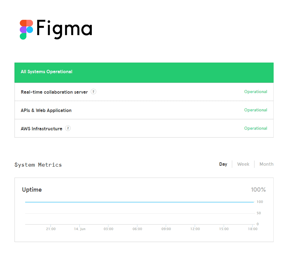
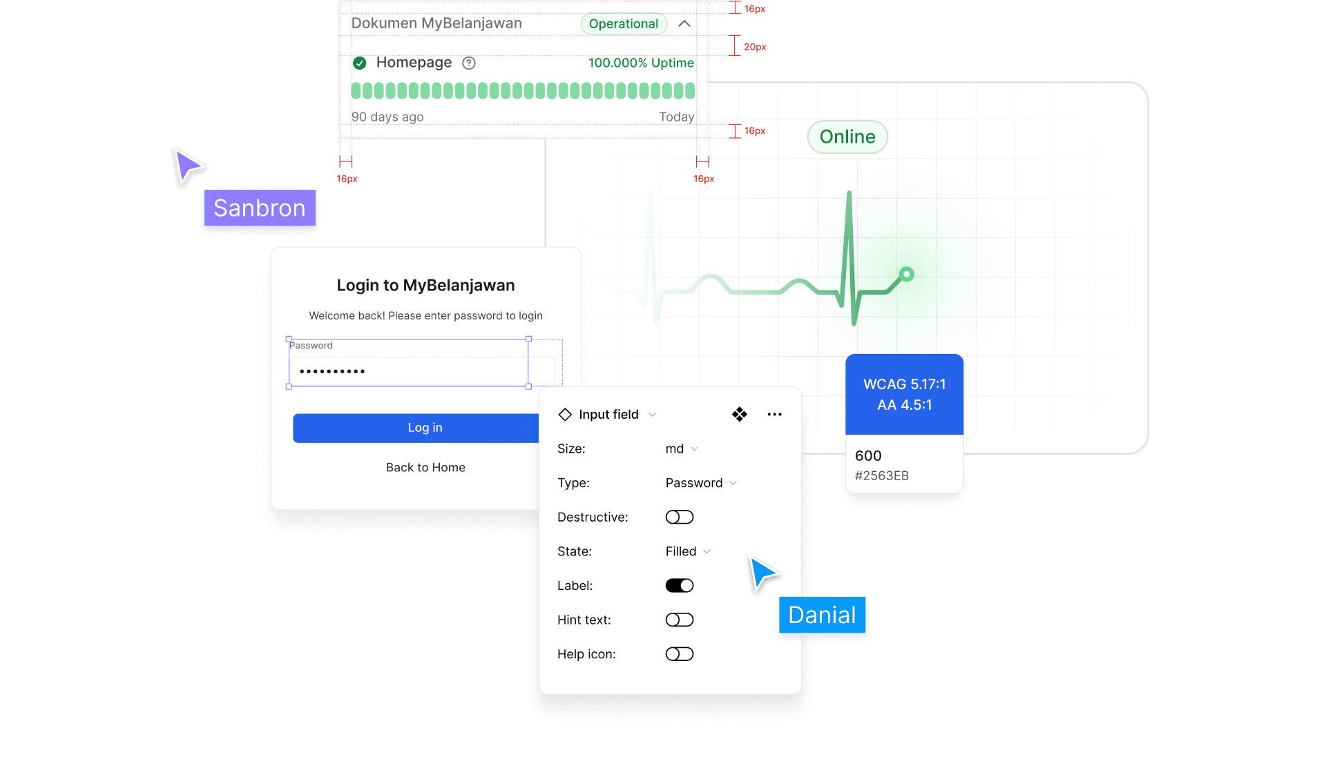
We like the status indicator at the top. It clearly shows all systems are operational right away
We like the status indicator at the top. It clearly shows all systems are operational right away
We like the status indicator at the top. It clearly shows all systems are operational right away
BAD
BAD
BAD
The system list lacks uptime and downtime details. The chart below is helpful but feels disconnected from the main status view
The system list lacks uptime and downtime details. The chart below is helpful but feels disconnected from the main status view
The system list lacks uptime and downtime details. The chart below is helpful but feels disconnected from the main status view
OPPORTUNITY
OPPORTUNITY
OPPORTUNITY
We can reuse the top indicator as a foundation and enhance it with more meaningful, real-time visuals
We can reuse the top indicator as a foundation and enhance it with more meaningful, real-time visuals
We can reuse the top indicator as a foundation and enhance it with more meaningful, real-time visuals
GOOD
GOOD
GOOD
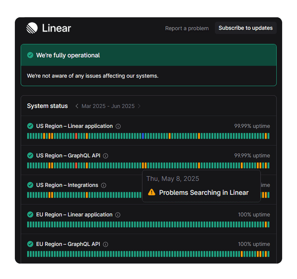
We love Linear. The status is clear and interactive. It shows real-time details, and users can click to view incidents instantly
We love Linear. The status is clear and interactive. It shows real-time details, and users can click to view incidents instantly
We love Linear. The status is clear and interactive. It shows real-time details, and users can click to view incidents instantly
BAD
BAD
BAD
The design is a bit too simple. It misses dedicated pages for incidents and maintenance logs
The design is a bit too simple. It misses dedicated pages for incidents and maintenance logs
The design is a bit too simple. It misses dedicated pages for incidents and maintenance logs
OPPORTUNITY
OPPORTUNITY
OPPORTUNITY
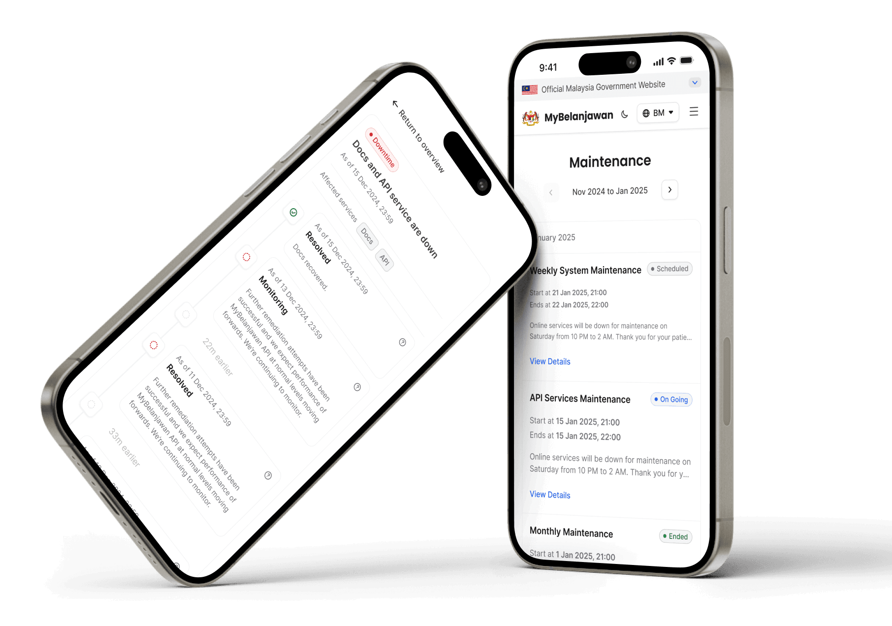
We can keep the indicator bar approach. But we should also add incident and maintenance pages on nav bar so users can explore further.
We can keep the indicator bar approach. But we should also add incident and maintenance pages on nav bar so users can explore further.
We can keep the indicator bar approach. But we should also add incident and maintenance pages on nav bar so users can explore further.

GOOD
GOOD
GOOD
The only thing we liked is how simple it looks
The only thing we liked is how simple it looks
The only thing we liked is how simple it looks
BAD
BAD
BAD
The overuse of blue can confuse users, it’s hard to tell if a system is online or in maintenance. There’s no nav bar or anchor links, so users have to scroll all the way down to find incidents
The overuse of blue can confuse users, it’s hard to tell if a system is online or in maintenance. There’s no nav bar or anchor links, so users have to scroll all the way down to find incidents
The overuse of blue can confuse users, it’s hard to tell if a system is online or in maintenance. There’s no nav bar or anchor links, so users have to scroll all the way down to find incidents
OPPORTUNITY
OPPORTUNITY
OPPORTUNITY
Use clearer color schemes for status. Add a proper nav structure and anchor links for better navigation and visibility of all key sections
Use clearer color schemes for status. Add a proper nav structure and anchor links for better navigation and visibility of all key sections
Use clearer color schemes for status. Add a proper nav structure and anchor links for better navigation and visibility of all key sections

GOOD
GOOD
GOOD
We like the simple layout and use of illustrations. It adds a bit of fun
We like the simple layout and use of illustrations. It adds a bit of fun
We like the simple layout and use of illustrations. It adds a bit of fun
BAD
BAD
BAD
Illustration dominates the first view but doesn’t show the actual system status. There’s no clear indicator when you land, which can delay understanding
Illustration dominates the first view but doesn’t show the actual system status. There’s no clear indicator when you land, which can delay understanding
Illustration dominates the first view but doesn’t show the actual system status. There’s no clear indicator when you land, which can delay understanding
OPPORTUNITY
OPPORTUNITY
OPPORTUNITY
Use illustrations or animations that reflect real-time status directly, not just decorative visuals
Use illustrations or animations that reflect real-time status directly, not just decorative visuals
Use illustrations or animations that reflect real-time status directly, not just decorative visuals
As we looked closer, we noticed something
As we looked closer, we noticed something
As we looked closer, we noticed something

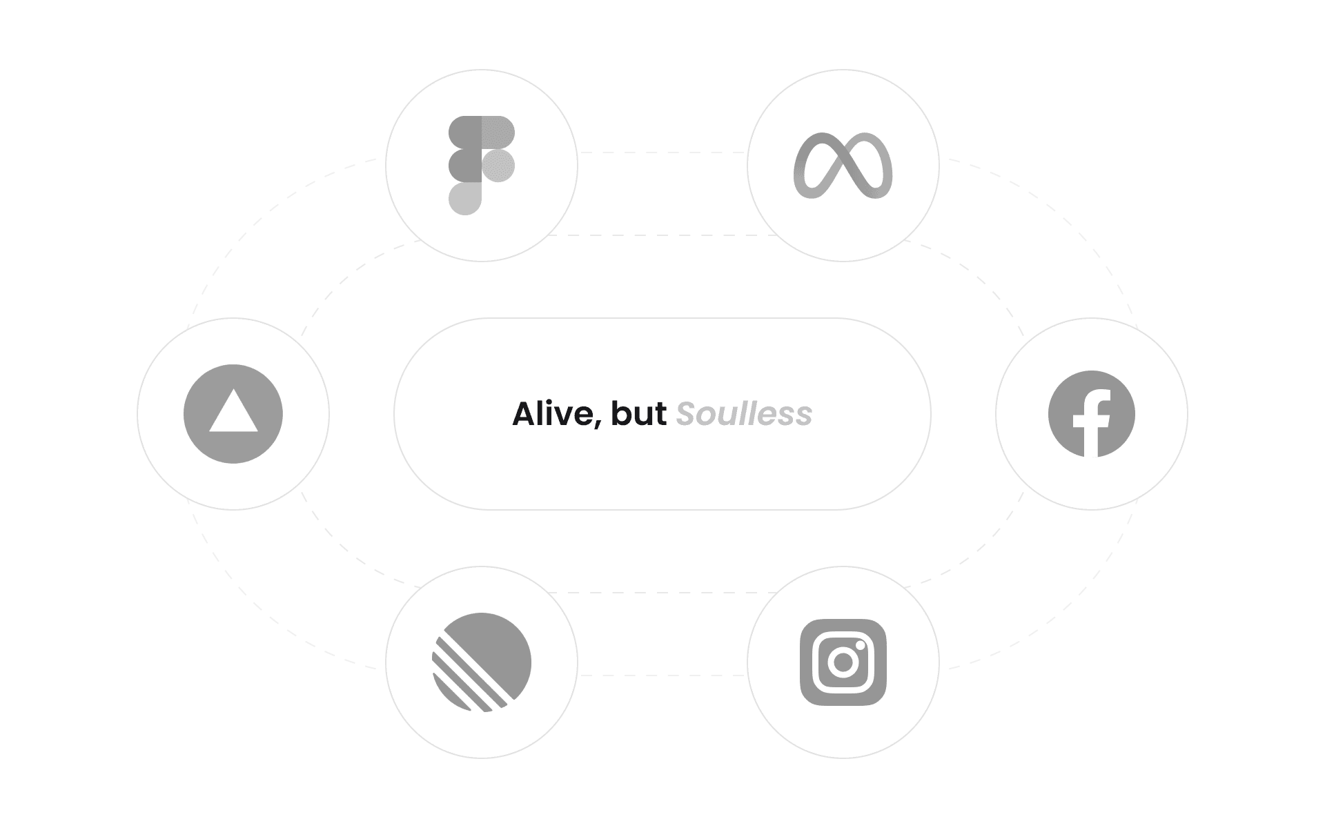
Many of them felt the same. Functional, but flat.
Informative, but soulless
Many of them felt the same. Functional, but flat. Informative, but soulless
Many of them felt the same. Functional, but flat.
Informative, but soulless
So... How Might We ?
So... How Might We ?
So... How Might We ?
We make users feel the system's status before they even read it?
We make users feel the system's status before they even read it?
We make users feel the system's status before they even read it?
We stay functional but still leave an impression?
We stay functional but still leave an impression?
We stay functional but still leave an impression?
We bring soul to a page that's usually ignored?
We bring soul to a page that's usually ignored?
We bring soul to a page that's usually ignored?
CONCEPT
CONCEPT
CONCEPT
That’s how we imagined system status
That’s how we imagined system status
That’s how we imagined system status
Not just text on a screen, but a
Not just text on a screen, but a
Not just text on a screen, but a

users could
users could
users could
feel the moment they landed.
feel the moment they landed.
feel the moment they landed.
We weren’t designing a page. We create
We weren’t designing a page. We create
We weren’t designing a page. We create

The pulse had to speak before the text ever could
The pulse had to speak before the
text ever could
The pulse had to speak before the text ever could
That’s why we focused on the very first moment a user lands.
That’s why we focused on the very first moment a user lands.
That’s why we focused on the very first moment a user lands.
PROCESS
PROCESS
PROCESS
Our design process followed a clear flow from static concept to a live, responsive component
Our design process followed a clear flow from static concept to a live, responsive component
Our design process followed a clear flow from static concept to a live, responsive component
Building
Building
Building

in
in
in

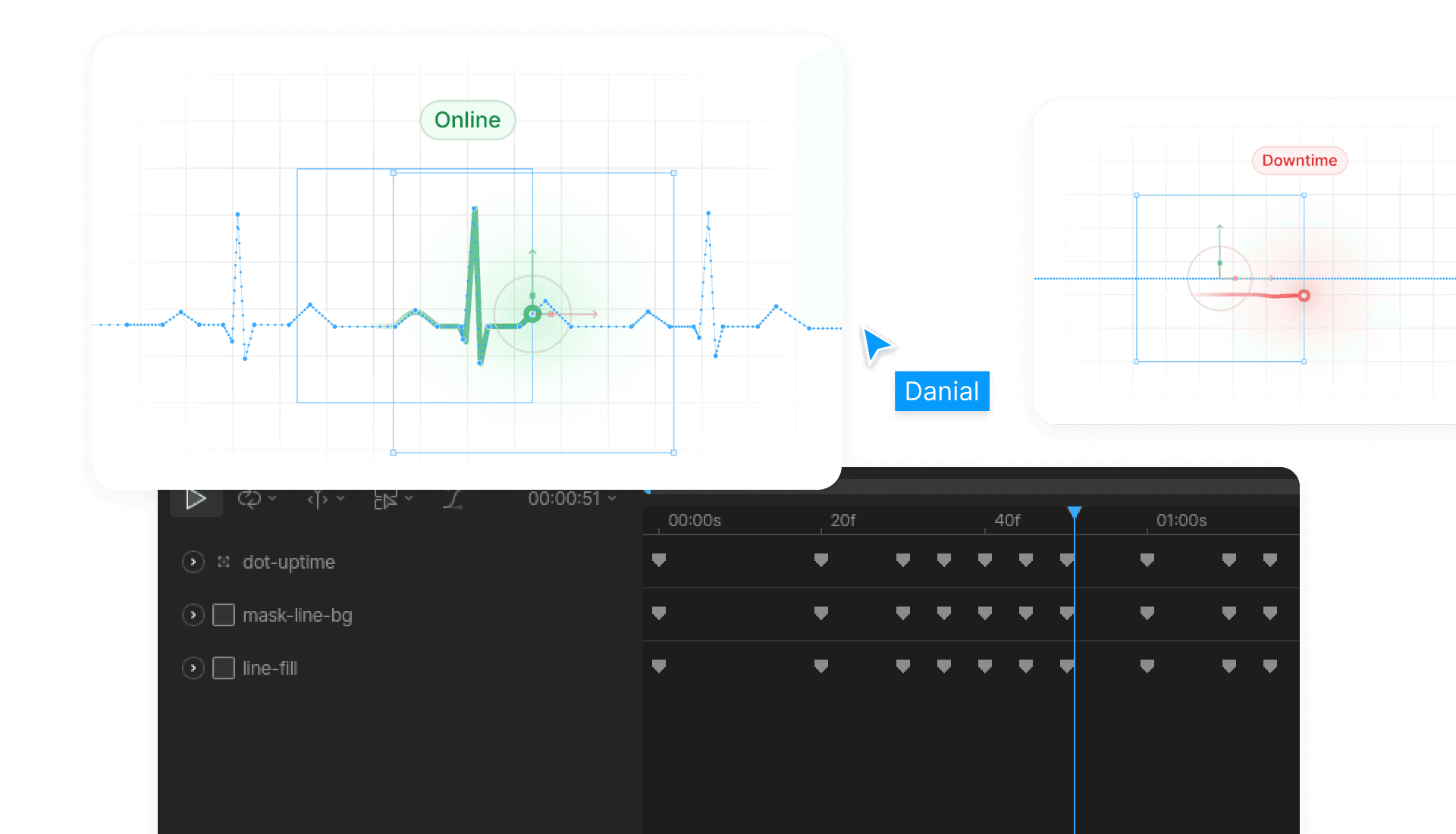
Each pulse state was designed for clarity using simple shapes, readable tags, and color cues that signaled urgency without noise.
Each pulse state was designed for clarity using simple shapes, readable tags, and color cues that signaled urgency without noise.
Each pulse state was designed for clarity using simple shapes, readable tags, and color cues that signaled urgency without noise.
Make visuals
Make visuals
Make visuals

with
with
with

We used its state machine to animate three heart rhythms: stable, irregular, and flatline. Each state could be triggered programmatically to match the real-time system condition.
We used its state machine to animate three heart rhythms: stable, irregular, and flatline. Each state could be triggered programmatically to match the real-time system condition.
We used its state machine to animate three heart rhythms: stable, irregular, and flatline. Each state could be triggered programmatically to match the real-time system condition.
Integrate with
Integrate with
Integrate with

via
via
via

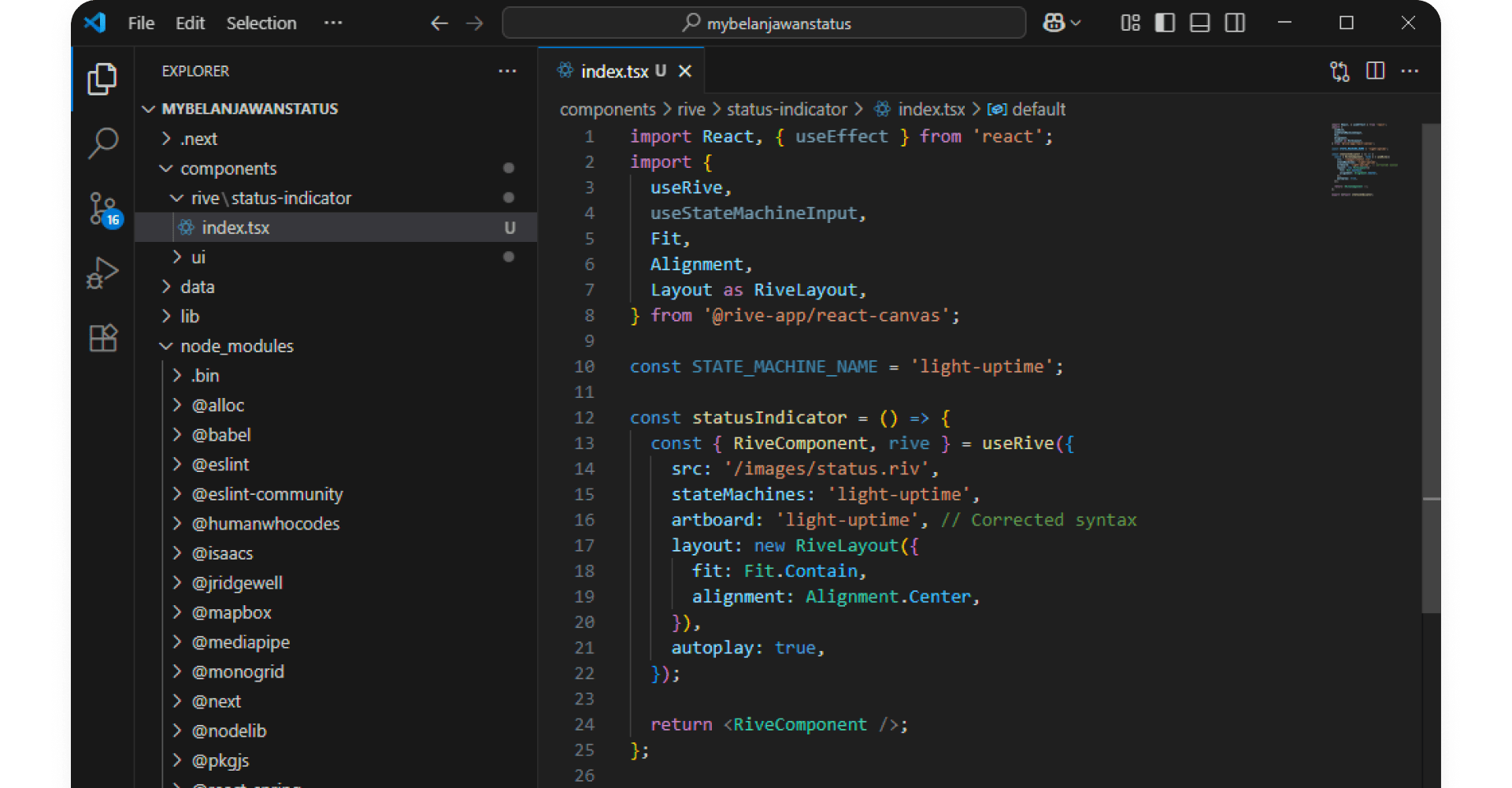
We imported the Rive animation into the project and built a component that connects to its state machine. That component was placed in the hero and linked to backend data, so whenever the system status changed, the correct animation played in real time.
We imported the Rive animation into the project and built a component that connects to its state machine. That component was placed in the hero and linked to backend data, so whenever the system status changed, the correct animation played in real time.
We imported the Rive animation into the project and built a component that connects to its state machine. That component was placed in the hero and linked to backend data, so whenever the system status changed, the correct animation played in real time.
Clarity That Connects
Clarity That Connects
Clarity That Connects
The heartbeat metaphor brought unexpected clarity to something often overlooked. What was once just a system page became a familiar signal users could trust. It reminded us that even the quietest parts of a product can carry meaning.
The heartbeat metaphor brought unexpected clarity to something often overlooked. What was once just a system page became a familiar signal users could trust. It reminded us that even the quietest parts of a product can carry meaning.
The heartbeat metaphor brought unexpected clarity to something often overlooked. What was once just a system page became a familiar signal users could trust. It reminded us that even the quietest parts of a product can carry meaning.